
The soul of color
Colors are not just hues: they are sensations. When we think of a color, we think of how it makes us feel.
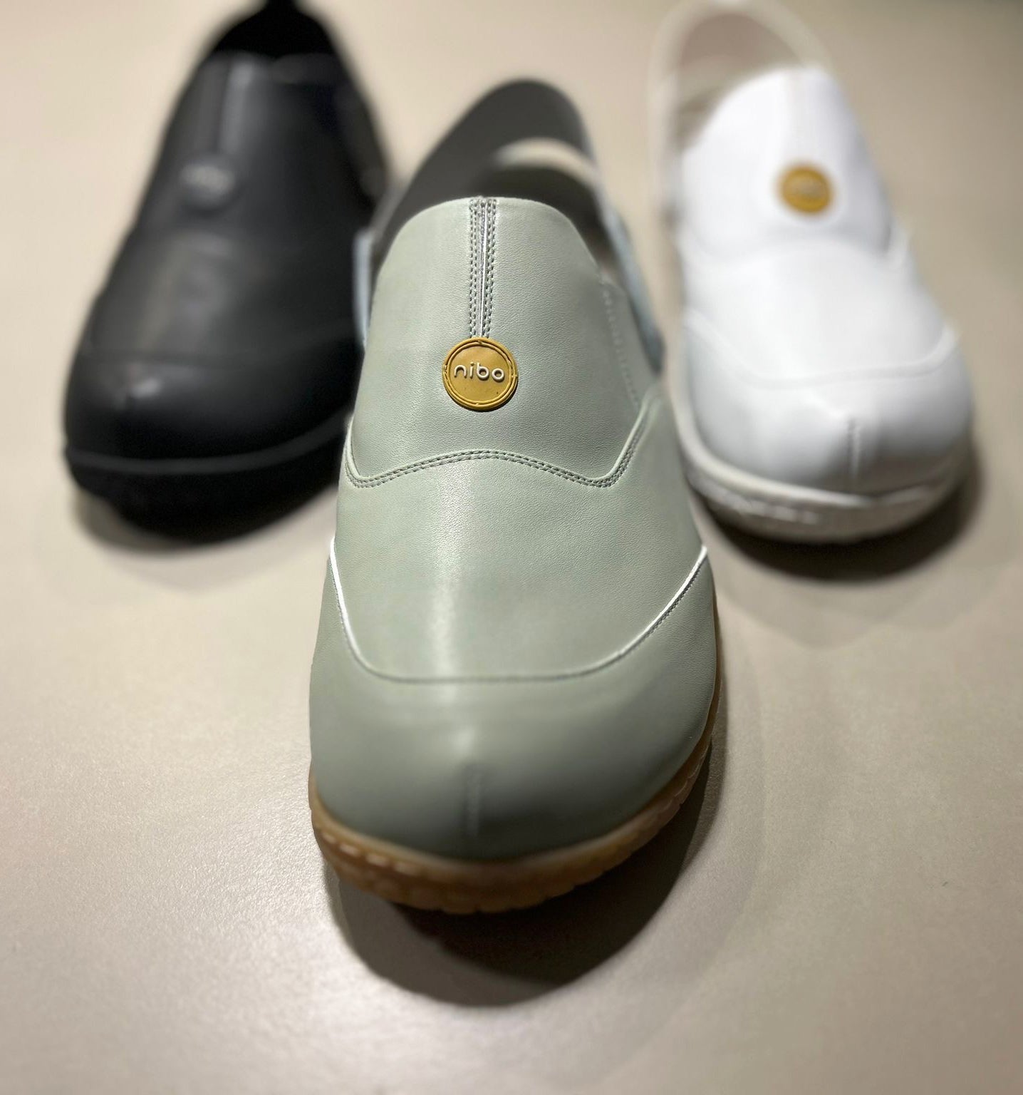
The blue that calms.
The green that breathes.
The white that cleanses.
The pink that embraces.
The gray that supports.
These are shades we don’t just see, we feel them. And perhaps that’s why, at Nibo, color isn’t chosen; it’s found.
Our design process always starts in the same place: observation.
We look at how light behaves on skin, on fabric, in the daily rhythm of those who walk a lot. We draw inspiration from everyday moments: the uniform that conveys calm, the landscape that helps you exhale, the texture of a bright morning. Colors are born from there, from what makes us feel present.
For us, a color isn’t just aesthetics: it’s an intention. Healthcare professionals, for example, are surrounded by cold lights, fast rhythms, constant decisions. A small chromatic touch can be a pause, a smile, a thread of energy in the middle of an intense day. That’s why we seek tones that accompany rather than overwhelm, that bring serenity and balance.
When we choose a color for a new design, we always ask ourselves: How will this feel on the feet? Because color doesn’t stay on the surface; it influences how we walk, how we breathe ourselves. A soft tone can make each step feel lighter. A vibrant tone can remind us that joy moves, too.
Because for us, colors are not chosen. They are felt.
